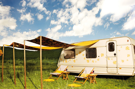
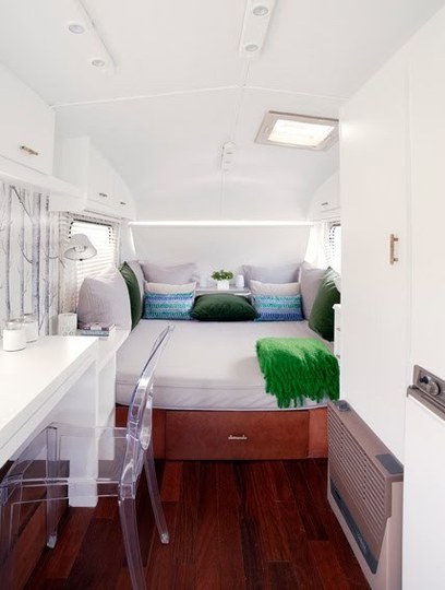
Nancy Mitchell from Los Angeles writes an interesting article over at Apartment Therapy on how as a child she always wanted to live in an RV. Recently, she discovered a unique caravan built by Caravanolic and decorated by Viceversa and she was inspired to write 5 tips about designing and living in a small space. Here they are:
- Stick to just one color palette
- Make your furniture multi-task
- Use vertical space as well as horizontal space
- Arrange more public uses closest to the door
- Don’t be afraid to have fun
To read the full article go over to Apartment Therapy and be inspired by all the great photographs.


The one color palate – white? – is boring and looks way too sterile to me, like a doctors office, even a hospital room has more color. No thanks, I’m not buying that as a way to go. I want to see fun, happy, lively colors in my RV. I am amused by the shrunken deer? head, lol …
How come nobody seems to be able to spell “palette”? Except for the original article writer, that is.
palette palette palette palette palette
palette palette palette palette palette
palette palette palette palette palette
palette palette palette palette palette
palette palette palette palette palette
palette palette palette palette palette
palette palette palette palette palette
palette palette palette palette palette
By Josh, I believe I’ve got it….LOL, Joe3
Why people continue to leave non-constructive criticisms in the comments, I will never know. I seriously doubt anyone cares what you think about the colour palette, especially when the original article is posted on an amazing home design website. The interior is entirely on-point with current design trends.
we live in a small home, a 1956 spartan trailer, 385 sq. ft. this all white look would drive me nuts living in a small home. i want my eyes to have something to see other than tiny home. white isn’t even a color. this space looks like it’s designed for a control freak. have some fun.
I agree. It seems a bit much, especially when it’s your entire home that’s all white, not just one room. And is it just me, or do those miniature deer heads seem a bit out of place in such a modern-looking interior. Obviously they’re just tiny replicas and not real mounted deer heads, but it seem weird to me to have that one piece that represents the outdoors in an otherwise very chic/modern interior. It just stuck out like a sore thumb to me. But what do I know – I’m no designer, but I did stay at a Holiday Inn Express last night.
I wonder if the deer head is some kind of rack to hang things on? Or it could just be a touch of eccentricity. Or a gift from a well-meaning relative. My uncle has a weird coat rack made of actual deer forefeet with hoofs, kind of creepy, this one is nicer, if that’s what it is. Apparently fake animal heads are ‘trendy’ right now though.
They might be. In the pictures on the website that was linked to you can see there are actually two of them – one on either side of a full-length mirror. They’re not terrible looking, by any means; they just seemed a little out of place.
What all this talk about pilates in homes? I just got over learning that this is an exercise program not a sushi lunch special in Italy. When I saw that it was about……palette? Ohhh. Nevermind.
Seems like folks are a little quick to tell others how they don’t like this that and the other. No one really ask you. Thanks for sharing pictures of your camper/home. I think you did an excellent job.
Yes, indeed, this is beautiful. Interestingly, my mom, with 8 little monsters to care for (I am the eldest of the kids) always chose white or off white carpet. Her reason? You could see the spills and quickly clean them. We had a happy childhood, for those who may wonder 🙂 We just learned to be clean, neat, individuals.
Steve, I disagree. The article is “5 tips about designing and living in a small space” and because there is a ‘comments’ section, I/we ( the audience) IS being asked and can respond! I don’t like the sterile look and commented about it. I think the other 4 tips are very valid…and since I do live in a one room home, that palette wouldn’t work for me. My feelings !
I love the contrast of the dark floor and the white palette. The kitchen is a marvel. Nothing screams efficiency more than an RV kitchen. Beautiful home! Enjoy!
I agree, I love the white with the dark wood floor. And the color accents on the bed are great. It doesn’t look sterile at all. I really nice soothing space. Airy and fresh!
I agree with the white, very classy with the chair, everything. But then, I paint every interior white and accent with art or dodads. So may be a bit bias. GOOD Job!!
The biggest problem with white is it shows dirt too easily. If you have a busy outdoor life you WILL track in all kinds of stuff and it will be a nuisance to keep the white looking magazine ready. Even more so for kids and pets. If that doesn’t bother you much you’re OK. A lot depends on what you’re surrounded by and how you interact with it. In my place the biggest thing is @!*%!! pine and spruce needles. Any kind of looped pile is just a trap for those things so I avoid it. A dark wood floor looks good, until you start tracking in a lot of light coloured dusty clay. Even if you wipe your feet and take off your shoes you can still have it on your clothes and in a small space you’re going to be knocking it off every time you turn around. The best decor isn’t just something that looks good, it also has to function in ways that don’t make your life more difficult. If you don’t have access to laundry facilities it might be best to avoid large expanses of light coloured fabric.
This caravan is nothing short of cute. Everyone camps differently, and, I could see how you could keep this space clean just by leaving your shoes at the door and choosing washable interior finishes. If you want to rough it, sleep in a tent. Bravo, for creating a beautiful, functional and unique living space. Now, how is it’s affordability?
I love white kitchens and baths but not for a bedroom and I also would love to see some splashes of color in the kitchen here and there. My kitchen is all white with splashes of the primary colors of red, yellow, blue, and green. Everyone loves it. Makes it so bright and cheery! 😉
Harsh on the eyes. Interesting to see how the lucite(?) chair, at least visualy, takes no space.
different strokes
I like the white, it is very (BRIGHT) but again, i would just add a bit of my own (fake green plant)and a bit more color, but i like the white, in my tiny (900 sq. ft) home, i am going white all around, but accenting with color…and i am very ecclectic, so i would probably have the deer head myself, but this year i am going beachy, with sea shells and glass….a bit nautical (i also like waterhouses)….but am land locked. You did a very tasteful job.
P.S.
I also love horses, and have a romanesque statue of a horse, (i told you i am ecclectic) along with my whales, shells, and such…dispute that…
I have a teensy kitchen, and am in LOVE with the little stove shown in this picture. Does anyone know where one finds these? And if they’re okay to use in a house vs trailer? (My kitchen is 6 x 8, so space is really at a premium.)
White symbolizes purity. Enthusiastic aversion to a white palette must mean something. Personally, I love all the white. White light is, in fact, all colors, so it adds a kind of fullness and luxury to a small space. And it is the perfect backdrop for a colorful life–the inhabitant’s accessories that will be displayed on top.
But I think the designer’s tip is that a single palette or color (doesn’t matter what color)allows the eye to travel unencumbered from one highlight to the next, over and around the protrusions of furnishings and bulkheads, eliminating the need to judge the depths of the individual aspects of architecture, etc., that are not significant or not meant to be noticed. A technique along the same line is the use of the see-through chair.
Another tip I’ve found for cubical rooms is to have some place on each wall where you can see the wall itself from floor to ceiling. For some reason, my rooms seem larger if it is obvious where the plane of the wall is. Again, maybe it is less work for the brain to judge depth–I don’t know, but a monochromatic color scheme works in the same way by making the impression of continuous surfaces to the floor.
The whimsy of the antler coathooks catches my fancy also. They are an interesting focal point and are a perfect tie to what looks like a birch twig forest wallpaper.
I painted my small space all pale bluegreen. The walls recede in a softer way, and at night it looks like being outside. I liked the lucite chair, I might look for one for my desk. Green glass color would be awesome.
Whether or not I agree with color choices, this is very well done and the owner/designer should be proud of his/her efforts. I love the dark wood floors. I am planning to build a Tumbleweed house and I’m assembling material choices in my head. I just may go a shade darker on my wood all the way round. Thanks for sharing! Salute!
In small spaces one needs a light color. maybe a shale pale gray with white trim would be a nice alternative.